Theme Switcher in Angular: From Dark to Light and Back Again
Introduction
Offering a choice between light and dark modes in web applications enhances user experience and accessibility. In this article, we’ll explore how to create a dynamic theme switcher in Angular, using a service and a component. Let’s dive into the code!
Understanding the ThemeService
At the core of our theme-switching feature is the ThemeService. This service manages the theme state and applies the appropriate styles.
1
2
3
4
5
6
7
8
9
10
11
12
13
14
15
16
17
18
19
20
21
22
23
24
25
26
27
28
29
30
31
32
33
34
35
36
37
38
39
40
41
42
43
44
45
46
47
48
49
50
51
52
53
54
55
56
57
58
59
60
61
62
63
64
65
import { Injectable, WritableSignal, effect, signal } from "@angular/core";

export const storageKey = "theme";

@Injectable({
  providedIn: "root",
})
export class ThemeService {
  #path: string = "/assets/themes";
  #stylesheet: HTMLLinkElement | null = document.getElementById(
    "theme"
  ) as HTMLLinkElement;

  themeSignal: WritableSignal<string> = signal<string>("light");

  constructor() {
    this.initializeThemeFromPreferences();

    effect(() => {
      this.updateRenderedTheme();
    });
  }

  toggleTheme(): void {
    this.themeSignal.update((prev) =>
      this.isDarkThemeActive() ? "light" : "dark"
    );
  }

  private initializeThemeFromPreferences(): void {
    if (!this.#stylesheet) {
      this.initializeStylesheet();
    }

    const storedTheme = localStorage.getItem(storageKey);

    if (storedTheme) {
      this.themeSignal.update(() => storedTheme);
    }
  }

  private initializeStylesheet(): void {
    this.#stylesheet = document.createElement("link");
    this.#stylesheet.id = "theme";
    this.#stylesheet.rel = "stylesheet";

    document.head.appendChild(this.#stylesheet);
  }

  getToggleLabel(): string {
    return `Switch to ${this.isDarkThemeActive() ? "light" : "dark"} mode`;
  }

  isDarkThemeActive(): boolean {
    return this.themeSignal() === "dark" ? true : false;
  }

  private updateRenderedTheme(): void {
    if (this.#stylesheet) {
      this.#stylesheet.href = `${this.#path}/${this.themeSignal()}.css`;
    }

    localStorage.setItem(storageKey, this.themeSignal());
  }
}
This service initializes the theme based on user preferences, manages theme toggling, and dynamically updates the stylesheet link.
Building the ThemeToggleComponent
The user interacts with the ThemeToggleComponent to change the theme. It’s a standalone Angular component with a simple yet effective UI.
1
2
3
4
5
6
7
8
9
10
11
12
13
14
15
16
17
18
19
20
21
22
23
24
25
26
27
28
29
30
31
32
import { Component, inject } from "@angular/core";
import { ThemeService } from "../../shared/services/theme.service";

@Component({
  selector: "app-theme-toggle",
  standalone: true,
  imports: [],
  template: `
    <input
      id="theme-toggle"
      type="checkbox"
      [checked]="isDarkThemeActive()"
      (change)="switchTheme()"
      [attr.aria-label]="getThemeToggleLabel()"
    />
  `,
})
export class ThemeToggleComponent {
  #theme: ThemeService = inject(ThemeService);

  switchTheme(): void {
    this.#theme.toggleTheme();
  }

  isDarkThemeActive(): boolean {
    return this.#theme.isDarkThemeActive();
  }

  getThemeToggleLabel(): string {
    return this.#theme.getToggleLabel();
  }
}
This HTML template includes a checkbox that toggles the theme when clicked.
How They Work Together
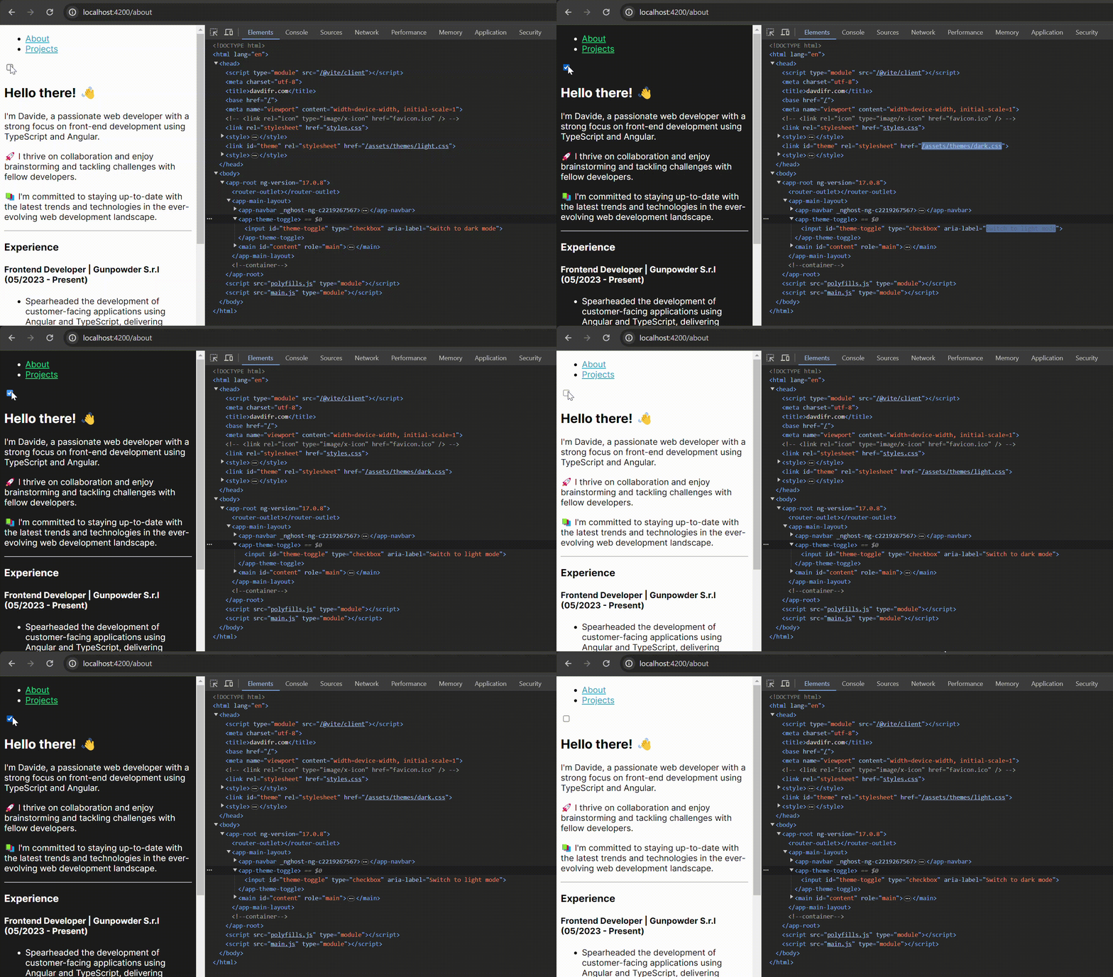
The synergy between ThemeService and ThemeToggleComponent is what makes the theme switching smooth and effective:
- User Action: When a user clicks the theme toggle checkbox,
ThemeToggleComponentcalls toggleTheme fromThemeService. - State Update:
ThemeServiceupdates the themeSignal, which triggers a change in the theme. - Dynamic CSS Update:
ThemeServicethen changes the href of the stylesheet link, loading the appropriate theme CSS. - Persistence: The new theme preference is stored in local storage for future sessions.
Switcher in actionConclusion
Implementing a theme switcher in Angular is not just about aesthetics; it’s about enhancing user experience and accessibility. With ThemeService and ThemeToggleComponent, you can offer a dynamic and responsive theme-switching feature in your Angular applications.
